Car Market Trends - Data Exploration
Nadiia Novakova published on
12 min, 2270 words
Categories: Python Data Science Data Analysis Data Preparation
In this article I want to show some basic data preparation and analytics tasks. Also I want to shown Plotly library for data visualisation.
I have been looking for some datasets that I can easily manipulate to demonstrate the first pre-step of the Machine Learning - data preparation and cleaning. So I started to surf the Internet for datasets I can somehow explain and easily interpret based on my experience.
For this tasks I used two Kaggle datasets:
I think it is going to be fascinating to work with these datasets because of their visibility and simplicity.
The goal of this research is to show the common trends in the totaly different car markets as well as people preferences in different societies, but not to estimate total sales and so on. I believe this research is representative enough for this, but is not enough to assess this market.
The full source code you can find here: GitHub
Ukrainian Cars
Let’s start with Ukrainian cars dataset.
We will use Pandas and Numpy libraries in this research.
import pandas as pd
import numpy as np

ua_cars=pd.read_csv("cars/ua_vehicle_price.csv")
Let's look deeper into the columns:
ua_cars.columns
Index(['brand', 'model', 'year', 'body', 'price$', 'car_mileage', 'fuel',
       'power', 'transmission'],
      dtype='object')
ua_cars.head(10)
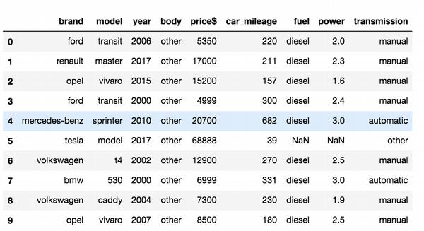
Calculate total amount of cars by brand.
#Total count cars by brands
ua_cars["brand"].value_counts().head(10).plot(kind='bar')
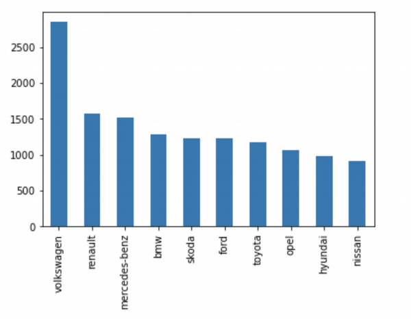
Here we see that Volkswagen is a top brand in UA. It make sense to me either, because there are a lot of VW models available for majority of car users in Ukraine.
Next let’s describe numeric and categorical variables in the dataset:
#Statistic for numerical features
ua_cars.describe()
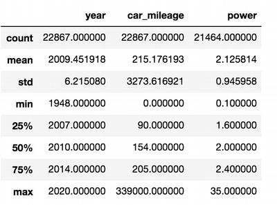
In this table we can see that data has some strange behaviour and the reason for that can be the outliers.
For example the max power = 35, when mean = 2.125 and min = 0.1. So this dataset needs more transformations.
Car mileage looks better and we can accurately say that average car mileage is 215 176 km.
#Statistic for categorical features
ua_cars.astype('object').describe().transpose()
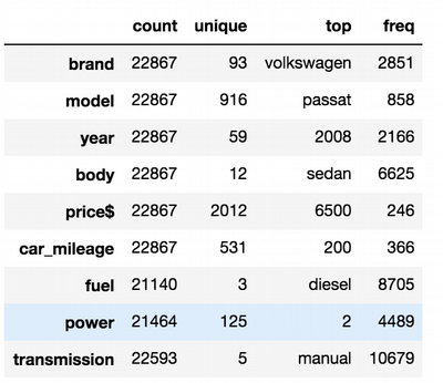
Here we see again that top brand is VW, and top model is “Passat”. The top
Very interesting observation is that the most popular body type in Ukraine is a sedan. It is one more point to my assumption. Actually my guess is that in general Ukrainian drivers prefer cheap economical sedans, probably with manual transmission and diesel fuel. This is a perfect description of "People's car" (Volkswagen).
I would like to see all possible types of cars:
# All possible transmission types in ua_cars DataFrame
ua_cars["transmission"].unique()
array(['manual', 'automatic', 'other', 'typtronik', 'adaptive', nan],
      dtype=object)
There is some strange type like 'typtronik'. Nevertheless, I am interested more in manual and automatic types as they are more common.
It looks like that data in the data frame has incorrect types and should be transformed.
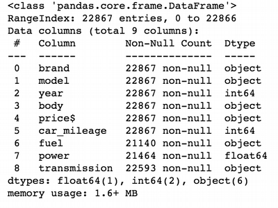
# Colums info for ua_cars DataFrame
ua_cars.info()
Rename some columns for convenience:
#Rename colums in ua_cars DataFrame
ua_cars.rename(columns={"price$":"price","car_mileage":"mileage"},inplace = True)
Here we see that price has object type, but it has to be a numeric. To fix that, we need to apply data type transformation.
#As we see in the REPL output, some of the colums should have another type than they have
#Price is object, but should be integer or float
#Change price column type
ua_cars[["price"]] = ua_cars[["price"]].apply(pd.to_numeric,errors='coerce')
ua_cars.head(5)
ua_cars.info()
So now it is time for some analytics. I would like to group data by some important, in my opinion, features and then compare them.
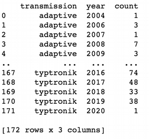
#Group cars by transmission and years and calculate their counts
ua_transmission = ua_cars.groupby(['transmission','year'])['year'].count().reset_index(name='count')
print(ua_transmission)
Here I calculate the amount of cars sold each year and group by transmission type for each year.
It will be good to see how it looks like in the graph. I am prefer use Plotly library for visualisation.
#import plotly lib for the further visualisation
from plotly.offline import download_plotlyjs, init_notebook_mode, plot, iplot
import plotly.graph_objs as go
Save grouped transmission type into separate dataframes.
#Extract main transmission types in separate dataframes
ua_adaptive_transmission=ua_transmission[ua_transmission['transmission']=='adaptive']

ua_automatic_transmission=ua_transmission[ua_transmission['transmission']=='automatic']

ua_manual_transmission=ua_transmission[ua_transmission['transmission']=='manual']
Now it is time to draw:
adaptive_trace = go.Bar(
    x = ua_adaptive_transmission.year,
    y = ua_adaptive_transmission['count'],
    name = "adaptive transmission"
)
automatic_trace = go.Bar(
    x = ua_automatic_transmission.year,
    y = ua_automatic_transmission['count'],
    name = "automatic transmission"
)
manual_trace = go.Bar(
    x = ua_manual_transmission.year,
    y = ua_manual_transmission['count'],
    name = "manual transmission"
)
layout = go.Layout(
    title='Amount of cars sold during a year by transmission types',\
    xaxis= {'title':"years"},yaxis = {'title':"total amount of cars"},)


fig = go.Figure(data = [adaptive_trace,automatic_trace,manual_trace], layout = layout)
iplot(fig)
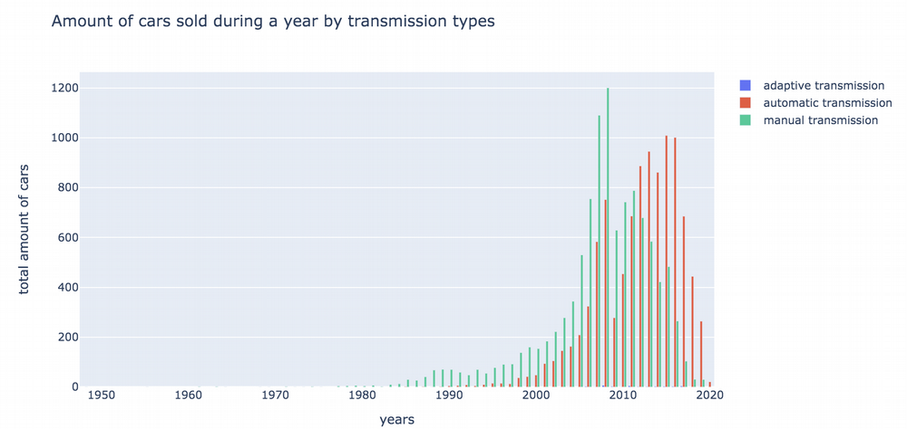
From this graph we can see:
- that manual transmission cars were super popular in Ukraine till 2012.
- Last years we saw the trend that automatic transmission became more and more popular. We can affirm that automatic transmission will become an absolute lead on Ukrainian market next years.
- Total amount of sales for both transmission types in UA are going down. Perhaps, it is due to economical reason.
- The top sale years for manual transmission are 2007-2008 and for automatic are 2015-2016.
Further I would like to compare two of the most popular brands (Toyota nad Volkswagen) in time.
Group data by brand, year and compare the max price for each.
#Total Toyota/VolksWagen sales by year
max_price = ua_cars.groupby(['brand', 'year'])['price'].max() \
  .reset_index(name='price').sort_values(['year'], ascending=False)

toyota_price=max_price[max_price['brand']=='toyota']
vw_price=max_price[max_price['brand']=='volkswagen']
Use scatterplot to visualise this data:
toyota_trace = go.Scatter(
    x = toyota_price.year,
    y = toyota_price['price'],
    name = 'Toyota'
)
vw_trace = go.Scatter(
    x = vw_price.year,
    y = vw_price['price'],
    name= 'VolksWagen'
)
layout = go.Layout(
    title='Total sales by year',\
    xaxis= {'title':"years"},yaxis = {'title':"total sales,K$"}
)

fig = go.Figure(data = [toyota_trace,vw_trace], layout = layout)
iplot(fig)
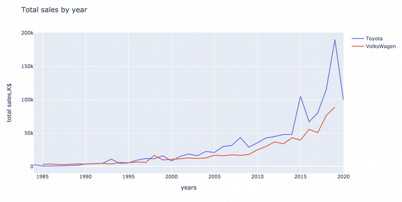
Here we can see that both top brands have a good sales growth. Volkswagen has more stable sales, but Toyota has more tricky trend. Some last years are more lucky for Toyota and the growth is extremely sharp (in 2015 and 2019). It is a point for additional research.
USA Cars
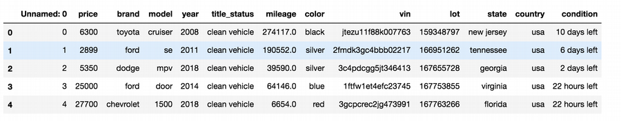
Now it is time to analyse another dataset - the dataset of US cars. It will be interesting to compare these two markets at the end.
us_cars = pd.read_csv("cars/usa_vehicles_price.csv")
I’ll skip some code blocks, because they are similar to UA cars. I will just describe some results. US cars dataset have next columns:
Index(['Unnamed: 0', 'price', 'brand', 'model', 'year', 'title_status',
       'mileage', 'color', 'vin', 'lot', 'state', 'country', 'condition'],
      dtype='object')
 This dataset is wider by features and that is great. So maybe we can extract more interesting information here.
us_cars["country"].unique() says to us this dataset collects info about Canada cars sold in US.
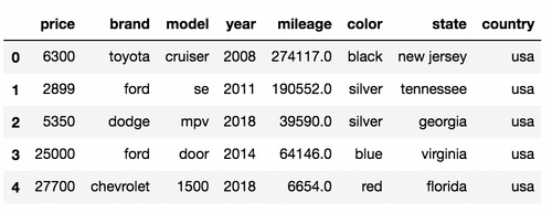
I want to delete them, because now I am not sure how to interpret them in the future.
Additionally lets delete vin numbers - official car id number: they can’t give us more useful info.
us_cars = us_cars.drop(['Unnamed: 0','vin',"condition","lot","title_status"],axis = 1)
us_cars= us_cars[us_cars['country']==' usa']
us_cars = us_cars.drop(["country"],axis = 1)
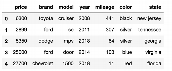
The first thing I noticed when I downloaded the dataset that mile units are used for US cars. Europeans “likes” American measures :-)
So let’s transform miles into kilometres:
us_cars['mileage']=(us_cars['mileage']*1.60934/1000).round(0).astype(int)
Let’s find top 10 popular brands in US:
us_cars["brand"].value_counts().head(10).plot(kind='bar')
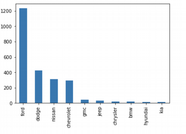 So in US, Ford is a leader of sales. Dodge, Nissan and Chevrolet are popular too, but Ford is absolute leader.
Also we can group data by brand and year and compare their maximal prices:
max_price_us = us_cars.groupby(['brand', 'year'])['price'].max() \
  .reset_index(name='price').sort_values(['year'], ascending=False)

ford_price=max_price[max_price['brand']=='ford']
dodge_price=max_price[max_price['brand']=='dodge']
nissan_price=max_price[max_price['brand']=='nissan']
chevrolet_price=max_price[max_price['brand']=='chevrolet']
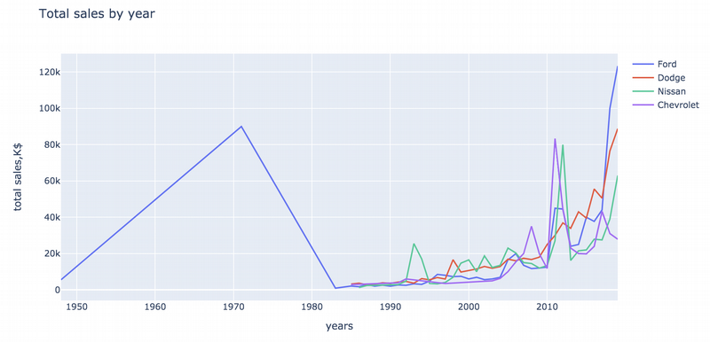
Here we see that there is no data about car prices for brands except Ford from the 40s till the middle of the 80s. I can explain that three other brands appeared in the US market just in the 80s. In the 70s Ford sharply grew down and then started slightly growing up with other new brands only in the middle of the 2000s. It looks like some crises on the market. Dodge shows stable growth in the last 10 years. Three other brands have a few peaks. Especially significant peaks for Nisan and Chevrolet in 2011-2012. I can guess that some new popular models appeared during this time. Fords became a leader again on the market at 2018-2019.
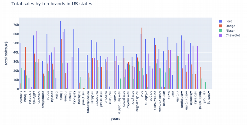
Next I would like to group data by the USA states, popular brands and review the trend:
car_by_state = us_cars.groupby(['state','brand'])['price'].max().reset_index(name='price')
Ok, now it is time for the most “cutie” side of the dataset. This is a car colour feature. I lived and visited a lot of countries and I see that each country has its own “character” also in car preferences. So I have some hypothesis about that and I want to get the proofs.
car_by_colors = us_cars.groupby('color')['model'].count().reset_index().sort_values('model',ascending = False).head(5)
fig= pl.bar(car_by_colors, x='color',y='model')
fig.show()
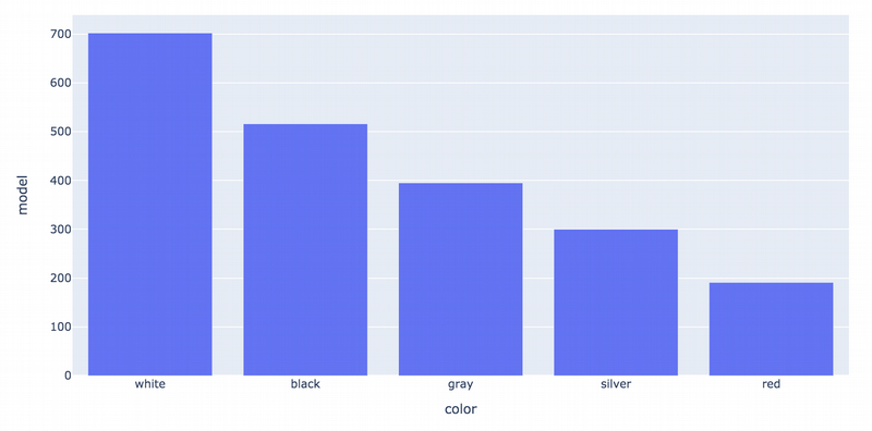
Ok, the colour number in US is white. Great! Less popular are black, grey/silver and red. (A brief digression: in Germany, the most popular car colours are black and dark grey. You don’t need to be an analytic to understand that. People explain that by cheaper prices for an insurance and subsequently such cars will be easier to sell. Other reasons are practicality and road safety).
My next goal to understand is some relationship between colour preference and state. I have an advice that in southern states white is more preferable than in northern and vice versa.
car_by_colors_state = us_cars.groupby(['color','state'])['state'].count().reset_index(name='count').sort_values('count',ascending = False)
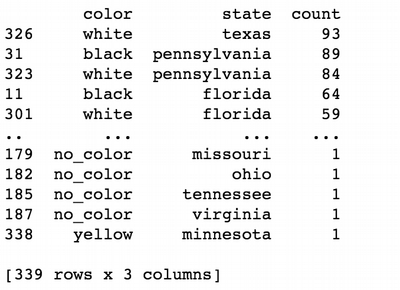
white_color_in_state=car_by_colors_state[car_by_colors_state['color']=='white'].head(5)
black_color_in_state=car_by_colors_state[car_by_colors_state['color']=='black'].head(5)
gray_color_in_state=car_by_colors_state[car_by_colors_state['color']=='gray'].head(5)
silver_color_in_state=car_by_colors_state[car_by_colors_state['color']=='silver'].head(5)
red_color_in_state=car_by_colors_state[car_by_colors_state['color']=='red'].head(5)

color = {'White':'white',
          'Black':'black',
         'Gray':'gray',
         'Silver':'silver',
         'Red':'red'}

white_trace = go.Bar(
    x = white_color_in_state.state,
    y = white_color_in_state['count'],
    name = 'White',
    marker_color=color['White']
)
black_trace = go.Bar(
    x = black_color_in_state.state,
    y = black_color_in_state['count'],
    name = 'Black',
    marker_color=color['Black']
)
gray_trace = go.Bar(
    x = gray_color_in_state.state,
    y = gray_color_in_state['count'],
    name = 'Gray',
    marker_color=color['Gray']
)
silver_trace = go.Bar(
    x = silver_color_in_state.state,
    y = silver_color_in_state['count'],
    name = 'Silver',
    marker_color=color['Silver']
)
red_trace = go.Bar(
    x = red_color_in_state.state,
    y = red_color_in_state['count'],
    name = 'Red',
    marker_color=color['Red']
)
layout = go.Layout(
    title='',\
    xaxis= {'title':" "},yaxis = {'title':" "}
)

fig = go.Figure(data = [white_trace,black_trace,gray_trace,silver_trace,red_trace], layout = layout)
iplot(fig)
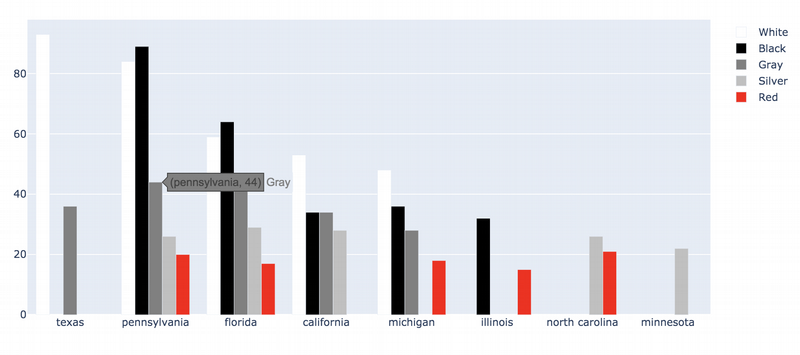
As I previously guessed, the white cars are selling better in southern states such as Texas, California and by surprise in Michigan, which is northern state. Black cars are popular in northern Pennsylvania. What is strange, that in southern Florida white cars are less popular than black ones. At the same time other colours are also represented.
In conclusion I would say that US car drivers choose domestic cars (Fords and Dodges) with practical colours depending on the state.
Summary
- UA and US markets are very different. People in Ukraine preferred small Europeans sedans such as Volkswagen or Japan Toyota. In the same time, in the US, people prefer domestic cars.
- Ukrainian market is transforming and the automatic transmission grows in popularity.
- My observations in car colours for US have been confirmed. White colour is the most popular in this country. However, colour preferences are changing from state to state.