PySpark & Plotly
Apache Spark is an abstract query engine that allows to process data at scale. Spark provides an API in several languages such as Scala, Java and Python. Today I would like to show you how to use Python and PySpark to do data analytics in Spark SQL API. I will also use Plotly library to visualise processed data.
Datasets
I am going to use public datasets available at:
The first dataset contains calendar quarter column that we will use to join with second dataset that has the same column. However, we will need first to do some data preparation to be able to join these two datasets.
Columns we are interested in:
- Prices: quarter and price index. There are no other columns so we take both.
- Loans: quarter is at index 0 and interest rate percent is at index 4. We skip all other columns.
Implementation
We will use such libraries:
- pyspark
- plotly
- datetime
We will need to following imports:
import pyspark
import datetime
import plotly.graph_objs as go
from datetime import datetime
from plotly.offline import plot
from pyspark.sql import SparkSession, SQLContext
from pyspark.sql.types import FloatType, DateType, StructType, StructField
from pyspark.sql.functions import to_date, col, date_format
CSV files into Spark Dataframes
At the very beginning we need to create few objects for Spark runtime:
spark = SparkSession.builder.appName('LoanVsPrices').getOrCreate()
sc = spark.sparkContext
sqlContext = SQLContext(sc)
We will use them later in the program code.
Loans
Now we can can read the first dataset for the loans using manually defined schema:
loanSchema = StructType([
    StructField("quarterDate", DateType(), True),
    StructField("percent", FloatType(), True)])

loanDf = spark.sparkContext \
    .textFile("data.csv") \
    .zipWithIndex() \
    .filter(lambda x: x[1] > 5) \
    .map(lambda x: x[0].split(',')) \
    .map(lambda x: (datetime.strptime(x[0], '%Y%b'), float(x[4]))) \
    .toDF(loanSchema)
While reading data.csv file we skip first 5 header rows. Then we split each row by comma and we take only 0 and 4 columns.
We parse them into Date and Float types respectively.
Prices
priceSchema = StructType([
    StructField("quarterDate", DateType(), True),
    StructField("index2010", FloatType(), True)])

priceDf = spark.read.format("csv").option("header", True) \
    .schema(priceSchema) \
    .load("QDEN628BIS.csv") \
    .select(to_date(col("quarterDate")).alias("quarterDate"), col("index2010"))
We use similar schema for reading prices. This time we use standard Spark API to read CVS files, since the prices file is much simpler as it has only one row as header and exactly two column that we need.
Debug
We can also print Spark DataFrame schemas and data samples for both datasets.
loanDf.show()
loanDf.printSchema()

priceDf.show()
priceDf.printSchema()
+-----------+-------+
|quarterDate|percent|
+-----------+-------+
| 2020-07-01|   1.24|
| 2020-06-01|   1.28|
| 2020-05-01|   1.27|
| 2020-04-01|   1.22|
| 2020-03-01|   1.18|
| 2020-02-01|   1.26|
| 2020-01-01|   1.35|
| 2019-12-01|   1.27|
| 2019-11-01|   1.25|
| 2019-10-01|   1.22|
| 2019-09-01|   1.24|
| 2019-08-01|   1.36|
| 2019-07-01|   1.49|
| 2019-06-01|   1.61|
| 2019-05-01|   1.67|
| 2019-04-01|   1.72|
| 2019-03-01|   1.79|
| 2019-02-01|   1.85|
| 2019-01-01|   1.95|
| 2018-12-01|   1.94|
+-----------+-------+
only showing top 20 rows

root
 |-- quarterDate: date (nullable = true)
 |-- percent: float (nullable = true)
+-----------+---------+
|quarterDate|index2010|
+-----------+---------+
| 1970-01-01|  37.6187|
| 1970-04-01|   39.315|
| 1970-07-01|  39.7142|
| 1970-10-01|  40.2131|
| 1971-01-01|  41.5103|
| 1971-04-01|   43.506|
| 1971-07-01|  44.1047|
| 1971-10-01|  44.2045|
| 1972-01-01|  45.1025|
| 1972-04-01|  46.2002|
| 1972-07-01|  46.6991|
| 1972-10-01|  46.9984|
| 1973-01-01|  47.6969|
| 1973-04-01|  49.8922|
| 1973-07-01|  50.3911|
| 1973-10-01|  50.3911|
| 1974-01-01|  51.4887|
| 1974-04-01|  53.5842|
| 1974-07-01|  54.0831|
| 1974-10-01|  53.7838|
+-----------+---------+
only showing top 20 rows

root
 |-- quarterDate: date (nullable = true)
 |-- index2010: float (nullable = true)
Join via SQL
Now we can use Spar SQL to join both dataframes using quarterDate column:
priceDf.createOrReplaceTempView("price")
loanDf.createOrReplaceTempView("loan")

joined = spark.sql(
    "select p.quarterDate, l.percent, p.index2010 from price p inner join loan l on p.quarterDate = l.quarterDate order by p.quarterDate") \
    .toPandas()
First, we define temporary SQL views to be able to reference our dataframes in SQL expressions.
Then we use plain SQL to join both dataframes on quarterDate column and return 3 column as a result.
PySpark is also integrated with Pandas, so that we convert Spark DataFrame to Pandas DataFrame to be able to use it further with Plotly library
We can also preview the joined data via python code print(joined)
   quarterDate  percent   index2010
0   2000-01-01     6.71  101.183899
1   2000-04-01     6.56  101.403297
2   2000-07-01     6.72  101.462097
3   2000-10-01     6.70  101.441597
4   2001-01-01     6.24  101.421303
..         ...      ...         ...
76  2019-01-01     1.95  146.000000
77  2019-04-01     1.72  149.699997
78  2019-07-01     1.49  151.800003
79  2019-10-01     1.22  155.500000
80  2020-01-01     1.35  155.899994

[81 rows x 3 columns]
Visualize via Plotly
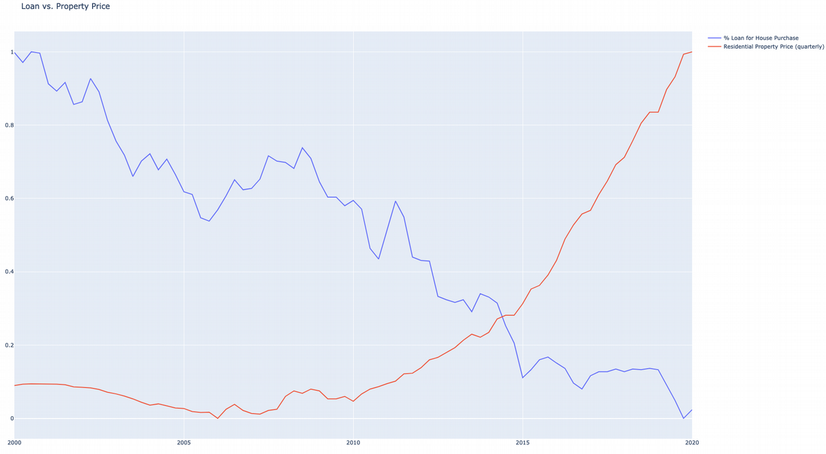
Before we use these joined data in the plot, we need to normalise the numbers, so that will look nicer on the plot. Normalisation also gives ability to compare both datasets on the same plot. If we do not normalise then Y axis will be too high, so that it will be hard to compare both scatter plots visually.
def normalize(df, feature_name):
    result = df.copy()
    max_value = df[feature_name].max()
    min_value = df[feature_name].min()
    result[feature_name] = (
        df[feature_name] - min_value) / (max_value - min_value)
    return result[feature_name]

percentValues = normalize(joined, "percent")
indexValues = normalize(joined, "index2010")
After normalisation we can use Plotly API to make a plot and save it into HTML file:
data = [
    go.Scatter(x=joined.quarterDate, y=percentValues,
               name="% Loan for House Purchase", text=joined.percent),
    go.Scatter(x=joined.quarterDate, y=indexValues,
               name="Residential Property Price (quarterly)", text=joined.index2010)
]
fig = go.Figure(data, layout_title_text="Loan vs. Property Price")
plot(fig, filename='plot.html')
If we open plot.html file in the internet browser, then it will look like the following:
Data Analyst Summary
Despite the 2008 financial crisis in housing led to price drop, the house purchase loan got increased and still increasing up to 2020 year. Bank loan interest rate may seem cheap, but regular house prices increases dramatically, so that cheap loan does not help that much. One has to still pay a lot in order to afford a house or own apartment.
Summary
We have seen that one can easily use PySpark and its SQL API to process and analyse the data. In real life, we should not use use Spark to analyse such small files, this can be done using other Python libraries. However, this example can be used to write another program to analyse peta-byte scale data using Spark cluster with massive parallelism.